Flat Tummies
Taking honest, transparent packaging to a whole new level.
Flat Tummies is on a mission to provide easy access to delicious, plant-based, nutritious foods. The project involved extensive user research and strategy to rebrand their identity and packaging. Based on the brand's core ethos of discovering the wonders of natural nutrition, we chose to work on an approach that handled transparency like no other brand has done before.
CLIENT
Flat Tummies
INDUSTRY
Food Products
SERVICE
User Research, Brand Strategy, Brand Identity, Collaterals, Packaging Design


The Logo
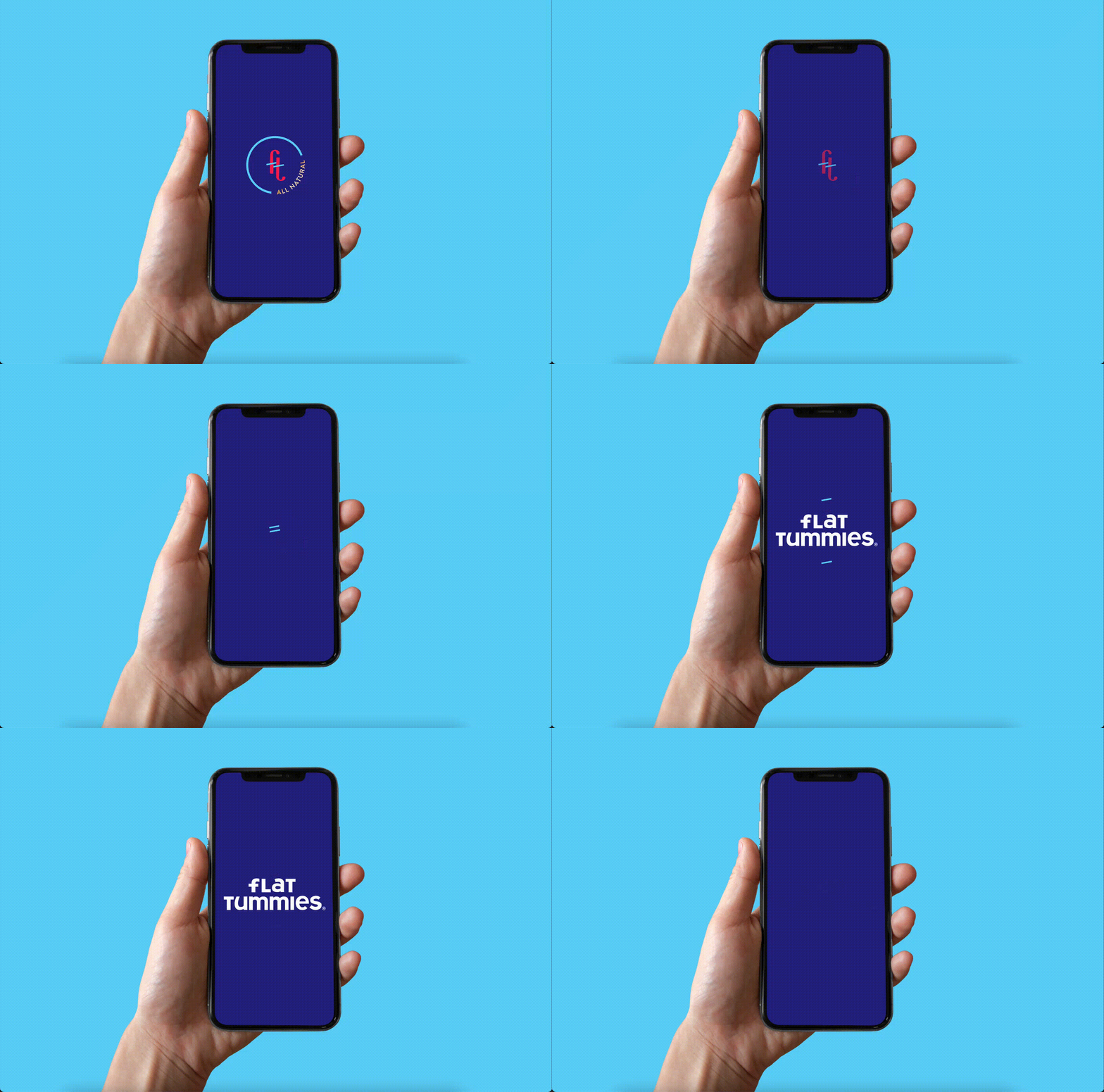
We branded Flat Tummies with a stylish insignia and bold mixed-case typography which makes for a very fresh, contemporary take on healthy eating.


Using the brand's quirky story of their commitment to clean snacking, we revolved the strategy around being 'nuts about nutrition'. We chose to stay away from force-fitting the typical queues of aggressive fitness in the design. Instead, we focussed on what people really wanted to know.
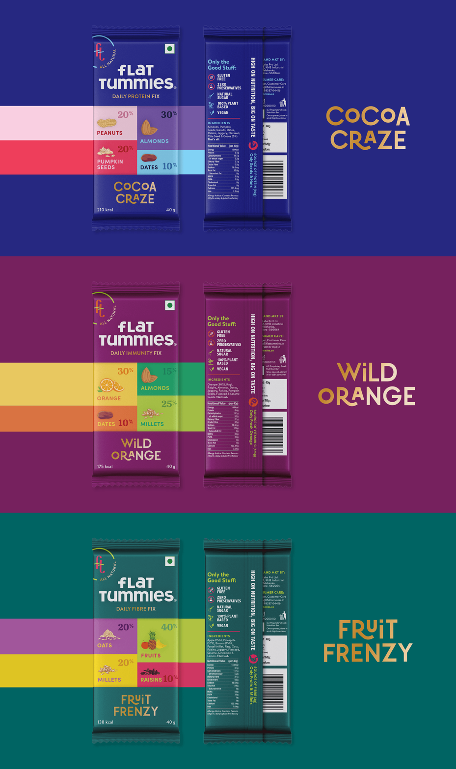
There was an evident leap towards transparency of ingredients on packaging, but most brands play the safe route and not tell us how much of the ingredient really was in the pack. All that you need to know is right up front, not just what's inside but how much of it too.


Packaging Architecture
We set up the information architecture to be striking in its simplicity. With the intent of providing as much information about the product in the simplest form, we played with palettes and type to be dynamic yet easy to adapt.


Flat Tummies is a new age FMCG brand that launched its rebrand in 2021 and is steadily expanding its product line with the new visual language we developed across multiple categories.
Designed at Lucid Design


